How to Change an Instagram Chat Theme and What the Other Person Sees
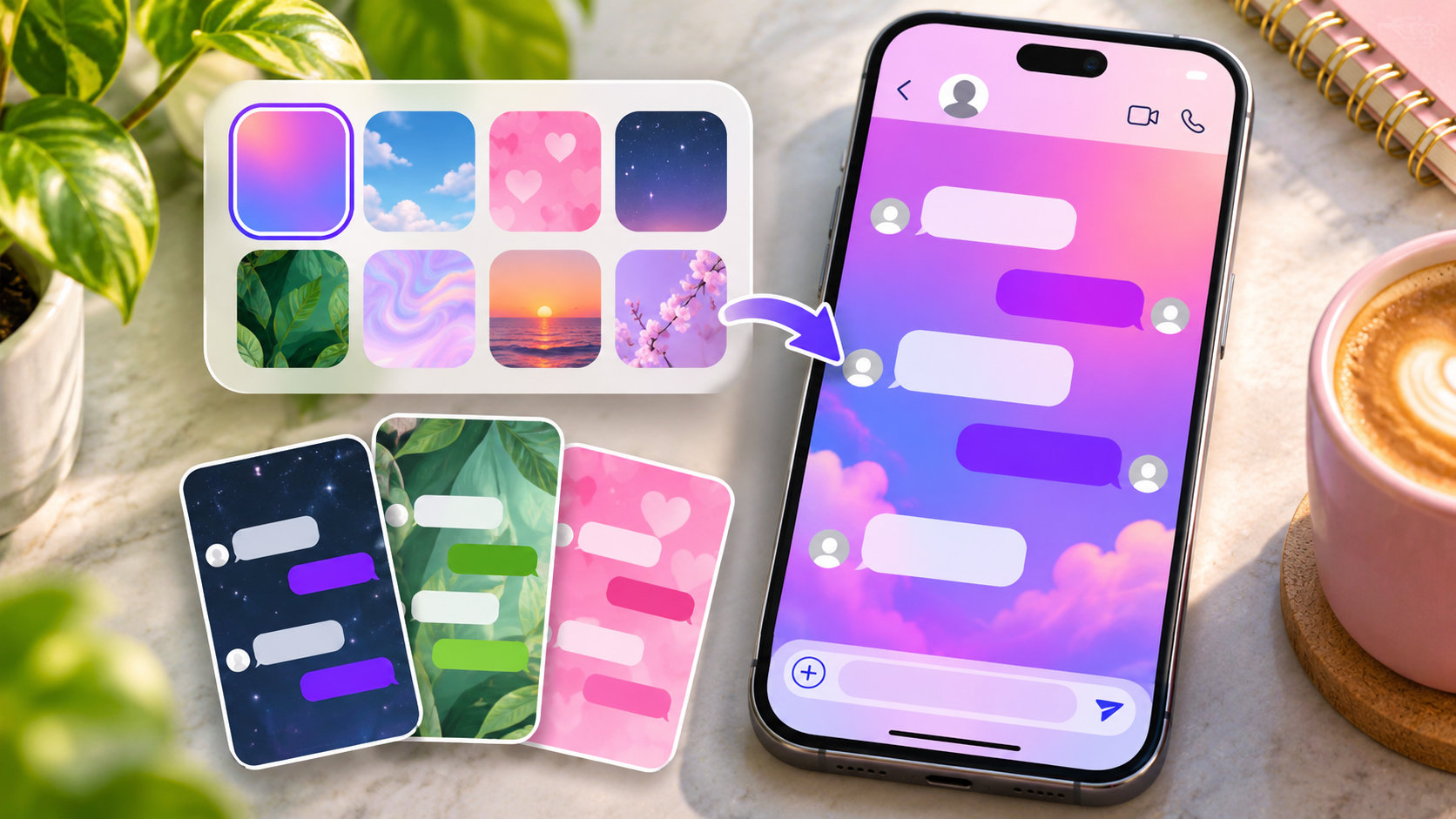
TL;DR: Open your conversation in the Instagram app. Tap the name at the top, choose Theme, then pick a design. If a preview opens, tap Select to apply it. The new look is shared with everyone in that conversation. Instagram also adds an update inside the chat that can identify who changed it. A separate lock-screen alert isn’t guaranteed. To switch back, reopen Theme and choose the previous design or the default option.
A screenful of hearts looks quite different when you realize the other person can see it too. In Instagram Direct, choosing a background is a little like choosing a group name. You do it from your own phone, but the result belongs to the conversation. That matters as much in a two-person exchange as it does in a family group with fourteen opinions about pink.
How to set a chat theme on iPhone or Android
Use the Instagram app on an iPhone, Android phone or iPad. If you usually answer messages in a computer browser, open the same conversation on your phone to reach the theme controls.
First, check the chat header. Your private exchange with Mia and the group called “Mia’s birthday dinner” might both have her photo at the top. Setting birthday wallpaper in the wrong one would be an oddly efficient way to spoil a surprise.
-
In Messages, open the thread you’d like to change.
-
Tap the header above the messages, where Instagram displays your friend’s name or the group title.
-
Choose Theme or Themes in the chat details. The picker shows the designs available to that account.
-
Tap the design you want. If a preview opens, review it and tap Select or the confirmation button shown. Some choices, particularly color swatches, apply as soon as you tap them.
-
Return to the conversation. Check the wallpaper behind the messages and the color of the bubbles. You can also look for the update in the thread confirming the change.
You can open the list and look through the available names without picking one. Once you start tapping swatches, though, watch what the app does. A screen with a Select button gives you a chance to back out. If the list closes and the conversation is already blue, you’ve made the change. Opening the picker again starts another selection.
What the other person sees when you switch themes
Your friend sees the wallpaper and bubble colors you chose for that DM. A short activity entry marks the change in the thread. On your screen it may describe the action as yours. On your friend’s screen it can use your account name and identify the design you picked. Either person can reopen the menu and choose something else.
In a group, the theme applies to the group conversation. People who have the theme control can change it for the group, including after somebody else has chosen one. The latest selection is the one members should see when their apps refresh. A cousin who belongs to two groups with you can therefore see blue bubbles in one and an illustrated background in the other.
Does Instagram notify them? Yes, inside the conversation. A separate push notification isn’t guaranteed. Your friend could have the chat muted, open it hours later and still see that you changed the theme. On your side, the activity entry confirms that the change happened. It tells you nothing about whether their phone lit up or whether they were looking at it.
There’s no approval step for the other person. Suppose you try three designs while your friend is away and finish with the original. When they return, the wallpaper may look exactly as they remember it, but the thread can still show the changes. Some versions group several updates together. Tapping that summary can reveal the individual entries.
What about someone who follows you but isn’t in the chat? They can visit your profile and see the posts you’ve made available to them. The DM background has no public page. Dumpor’s public profile tools can’t show which design a friend picked for a private conversation.
Chat background, bubble color or dark mode?
The setting you want depends on what bothers you. If it’s the pattern behind the conversation, change the wallpaper through Theme. If the background looks fine and you just want blue bubbles, look for the color swatches. If every screen feels too bright after dinner, your phone has a more suitable control.
|
What you choose |
What changes on screen |
Who sees the result |
|---|
|
A ready-made chat theme |
A coordinated background and message-bubble design in the selected DM |
Both people in a one-to-one DM, or everyone in the selected group |
|
A solid color or gradient |
The bubble color or shading, usually against a plain background |
Everyone in that conversation |
|
A photo or AI-generated theme, where offered |
The chosen image or generated design becomes the conversation backdrop |
Everyone in the chat where you apply it |
|
Light mode, dark mode or screen brightness |
The appearance of supported screens, or how brightly the device displays them |
The person looking at that device |
A solid color gives the bubbles one shade. A gradient can move through several as you scroll. Neither requires a picture behind the text. If the picker has a Colors & gradients section, scroll past the illustrated themes to find it. Choosing a swatch can replace the illustrated look you previously applied. Instagram’s standard presets pair the wallpaper with their own palette.
We suggest judging a design against a long message, a short reply and a timestamp. A detailed scene can look lovely on its own, then put its brightest patch right under the small timestamp you need to find yesterday’s meeting details. For a busy group, a plain background with blue bubbles and readable times may be the one everybody ends up keeping.
Can you change the appearance just for yourself?
Even a single color swatch in Theme is a shared choice. If your aim is to make messages easier on your own eyes, start with the display controls on your phone. Lowering the brightness takes effect straight away. Switching your device to dark mode can also change how Instagram looks to you, depending on its appearance setting.
On an iPhone, open Control Center, press and hold the brightness slider, then tap Dark Mode. On Android, search your device’s Settings for Dark theme or Dark mode. Those controls also make sense if several chats and the inbox all seem to switch colors at sunset. Check whether the device has a light and dark schedule before trying to restore half a dozen conversations one by one.
Two people can have the same theme selected and still send each other slightly different-looking screenshots. One might use dark mode, larger text or a narrower phone. Compare the selected theme name in the chat details first. Matching names can settle the question in seconds, while comparing two shades of purple across two displays rarely settles much.
Using a photo or creating a theme with Meta AI
Open Theme in the intended conversation and look at the creation options above the presets. If Create with AI is available, you can describe a design, review the result and apply it to the thread. A short, visual prompt works well. For a walking group, try “misty green hills with a pale sky and an uncluttered center.” The open space gives the messages somewhere quiet to sit.
Some accounts also have an Upload option. Where it appears, tap it, select a picture from your phone, review how it fits behind the conversation and apply it. If your menu offers presets and AI creation but no upload button, those are the options you currently have in that chat. Attaching a picture beside the message box sends it as an ordinary photo message.
A photo you love in your camera roll will sit behind everyone’s messages once you apply it. For a group portrait, look at which faces the sample bubbles cover. A shot of the little harbor where you all met might work better than a picture of six people with three of them hidden behind the conversation.
There’s also a difference between having a photo behind the conversation and giving a friend a photo they can examine. If the point is to show which entrance to use, send the picture as a message with the entrance marked. Bubbles will cover parts of a wallpaper, and someone holding a different phone may see a different crop.
How to restore the default Instagram chat theme
Go back to the same DM, tap its name, and reopen Theme. To recover the exact design you had earlier, choose it again by name. To return to the ordinary appearance, look for Default, including in the colors and gradients section. Some versions offer Monochrome as a plain alternative. Check the sample if there’s a preview. If the option applies immediately, you can see the result in the conversation.
“Default” and “what we had before” can be two different things. If your book club spent a year using an ocean design, choosing the standard background will give everyone a plain chat. To get the waves back, look for the ocean design itself. If the app still shows its name in an earlier theme-change entry, that can save you a fair bit of scrolling.
Some designs come and go. Finding an old theme name in the conversation gives you a name to look for, but it doesn’t put a retired option back into the picker. Choose a similar design or a plain color if the one you remember is missing. For a theme you’d particularly miss, it’s worth checking that it still appears in the list before replacing it.
Restoring the default is another shared change. It takes effect in the same thread and can add a fresh activity entry. You can keep talking in the same place, with the earlier messages still there to refer to.
When the Theme option is missing or the change looks wrong
- You can see Reply, Copy or reactions. You’ve opened the controls for an individual message. Dismiss them and tap the name at the very top of the conversation to open its settings.
- There’s no Theme option on your computer. Use the Instagram mobile app for the documented theme controls. Open the actual thread, even if you first found the person by searching for their profile.
- The option is absent on your phone. Check another established DM under the same account. Then check for an app update, reopen Instagram and return to the original chat. Whether the option is missing in one thread or every thread helps narrow down the problem.
- The background reverts after you leave. Reopen the picker and check which design is selected. Look for a later change by another participant. If the choice never appears in the thread, check whether you left the preview before tapping its confirmation button.
- Only one participant sees the old design. Compare the theme name in the same conversation on both phones. Reopen the app on the device showing the old version and check its connection. A difference in brightness alone is a good reason to check display settings before changing the shared theme again.
An older tutorial may tell you to find an Update Messaging banner first. Start with the chat header in your current app. If Theme is already there, you can go straight to the designs.
If a saved choice repeatedly disappears across several chats, use Instagram’s Help menu to report the problem. Include your device, app version and the point where the design reverted. “The new background shows until I close this conversation” gives support something more specific to investigate than “my DMs look wrong.”
At Dumpor, we welcome corrections when Instagram moves a button or changes its label. If your theme menu follows a different route, the device type and the labels you see will help us review the instructions. Send the Dumpor editors a question or correction.
FAQ
Does Instagram tell someone who changed the chat theme?
Can I look at themes without the other person knowing?+
Opening the list and scrolling through it doesn’t select a theme. If Instagram gives you a preview with a confirmation button, you can close it before applying the design. The detail to watch is the first tap on a swatch, since some apply immediately. Getting to the picker also means opening the conversation, which can mark unread messages as seen. Whether the sender sees that indicator depends on your Instagram read receipt settings.
Do pink or purple messages mean someone liked or read my DM?+
The bubble color is part of the conversation’s appearance. A heart pattern can sit behind every message in the thread, including a grocery list. A reaction appears on a particular message, while a read receipt is a separate indicator. If you want to know what someone thought of the photo you sent, look for their reaction or reply. The shade of the bubble won’t give you an answer.
Will changing the theme erase old messages, pictures or voice notes?+
Your messages and attachments stay in the conversation. Scroll up after applying a theme and you can read an earlier exchange against the new backdrop. A photo you sent is still the same photo. An old screenshot is a different matter. It captured the design visible when you took it, so it can show yesterday’s wallpaper even while today’s chat displays a different one.
Can I set one theme for every conversation with the same person?+
Each conversation has its own selection. You might share a private DM, a family group and a dinner-planning group with the same person. Changing the private exchange affects that exchange alone. If you want to recognize a particular person’s replies, a nickname may be a better choice. Our guide explains who can set Instagram DM nicknames and who sees them.
If I upload a chat wallpaper, can the group see my camera roll?+
No. Group members see the picture you apply as the background. Your other photos stay in the albums on your device. Choosing a picture through Instagram’s photo picker gives chat participants no access to browse the rest of your library. If you want them to see a second photograph from the same trip, you’ll need to share that one separately.
Does a theme change also change the group photo or my Instagram profile?+
The theme affects the space behind the conversation and the styling of its messages. The group picture is the image people use to recognize the thread in their inbox. Your profile photo identifies your account across Instagram. To give a dinner-planning group an icon people can spot in their inbox, use the group photo control in the chat details if you have permission to edit it.
What if I want every Instagram chat to look darker?+
For a darker inbox and a darker app on your phone, use the device’s dark appearance setting or Instagram’s own appearance control if your version offers one. For the same specific wallpaper across several threads, open each conversation and apply the design there. Each choice is visible to the people in that thread, so a device-level change is the simpler option when you’re the only person who wants a dimmer screen.

 Telegram bot
|
TikTok Viewer